The menu that became a cube (a menu that is a cube) was a day old when Selim wanted it in the shared library. A study had said to wait. He didn’t.
moving in early
The library’s rule had been that a piece moves in when two apps use it and its decision is kept. The first plan for the hold and the context cube said: keep it in Cubes until a second app uses it. Selim overruled that: “we are just one person, many agents company… the risks are not here.” Apps pin an exact version of the library, so moving early breaks nobody. And using the same cube in Cubes, Anlat and Mosaic’s to-do cube is how its gaps show up, early, while he uses each app. “The naming is not that important.”
The plan was written as seven work items for agents, to run in parallel threads.
what moved first
The gesture came first. A long press had been hand-written in Cubes twice and in Anlat once, and the timings were already drifting (520 against 480 milliseconds). One directive now raises a single held event for a long press, a right click or the menu key. A pinch or a drag never raises it, and the click that follows a hold is swallowed. On the open question of 520 or 480, Selim answered in the doc that using 520 and letting each app set its own is “a good approach following cube-design principles.”
The icons came next, one set for every tile and for every view, with colours in the light and dark token files. Then the model: a contract each app fills from its own data, its words passed in, the shared levels as pure functions. The package says no words of its own. A part with no word stays blank rather than showing its code name. Last, the square itself: a component that draws one level as a complete square of icon tiles. A tap comes out as enter, done or out, and the app keeps its own route.
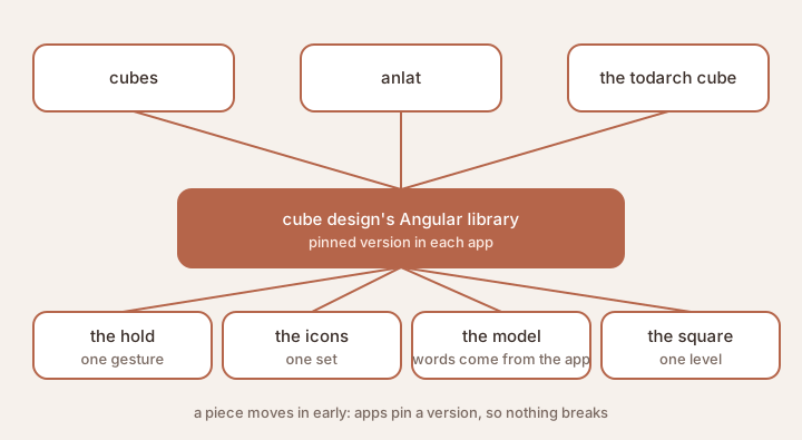
What moved into the shared library, and the apps that will use it.
A small catch from the icons thread was handed on: the default tile for hide asked for an icon that doesn’t exist. It was fixed at the source and guarded in the component too.
the first app tries it
Before the library’s first release, Cubes swapped its own hand-written hold and own-cube screen for the shared ones, in a local copy, and every part was walked at phone width in light and dark. That was the point of moving early: “so I could also see that it works and if it missed something that we will discover them early.” It did. The component now says which tile was tapped, so the next level can grow out of it, and its class names got a prefix because Cubes’ own tile styles leaked inside it. Both went into the library before its first version, not after.
a smaller cube to grow on
After four days of findings, decisions, a conformance run and 123 rows in the table of contributions, Selim could not keep up with what the agents had collected. The confusion between cube and piece kept coming back. So cube design was reshaped into a smaller set of files, a one-page core plus the principles, screens, dials and every open question with a proposed answer. The old file was kept whole beside it.
His simplest way to say it: a piece takes roles, like one person who is a son and a father at once, and everything else builds on that. “It’s easier to deal with a two by two cube than a four by four cube.” The idea was to apply cube design to cube design itself: put the same pieces together, and leave a smaller cube that he can hand to agents with this is my understanding.
Reading the table turned up some ideas that had never reached the files. Ten decisions are listed for him to confirm.