In Cubes, a press and hold opened a sheet that listed things. It worked, but it was a list in an app where everything else is a cube. In one day it became a cube too.
a brain dump
It began with a dictated brain dump about how that sheet should follow cube design, and it grew while Selim spoke. From renaming places to locations, to views that free the design from the forced square, to sort, order and move, ending in a gesture with all the fingers coming together, “like this gesture of Italian people”, to open the own cube of the cube you stand in. He noticed his own pattern: “cube design provides flexibility… it’s flexible almost infinitely.”
The bigger idea behind it: data belongs to the user, metadata belongs to the app, and both are cubes navigated the same way. Renaming, view, sort, move and hide all become parts of the piece’s own cube. Nothing new has to be learned, and nothing, like an old name, is lost.
The dump became a requirements doc and a plan of nine jobs, each with its own brief so that different agents can take them.
something to hold
Selim asked for a clickable prototype instead of mockups, because the idea is about moving in and out, and a picture cannot show that. Building it showed what the doc had not said. The own cube behaves like a piece seen close up (a tap chooses; it does not go in). And Cubes already had the second door the doc wanted a new gesture for: holding the cube on top.
Then his comment on the first version: “the context menu is not following cube design but instead listing. turn those screens into cubes and pieces also.” The earlier session had chosen lists on purpose, to avoid empty outlines in a cube nothing can be added to. The square won, and the outlines got a quieter line.
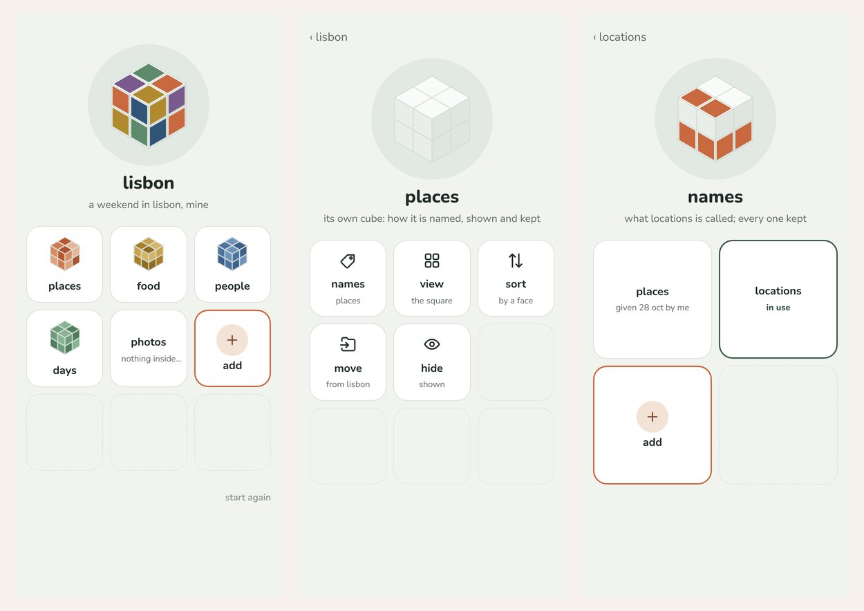
The prototype’s first flow: hold places and you walk into its own cube; in names, add locations and use it. Places is kept beside it (mock data).
fingers on a phone
A small test page read how many fingers coming together a phone reports. Four fingers turned out to be taken by the system every time, which disproved the guess that four would be the number that works. The recommendation is to park the all-fingers door and see Selim’s own phones first, since a visible door already does the job.
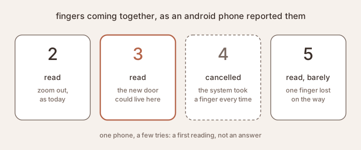
The first reading on an Android phone: three fingers read, four cancelled by the system.
Selim’s answer was cube design again: options are all valid. He wants both doors, the fingers and the cube on top.
the layout is mine to choose
Job 3 built the own cube in the app: no plus at the top, an eye button gone
from every tile, and hide itself a cube of two pieces, shown and hidden.
Hold the cube on top and you are in the own cube of the cube you stand in. Hide is a cube of two pieces, shown and hidden, one in use (prototype, mock data).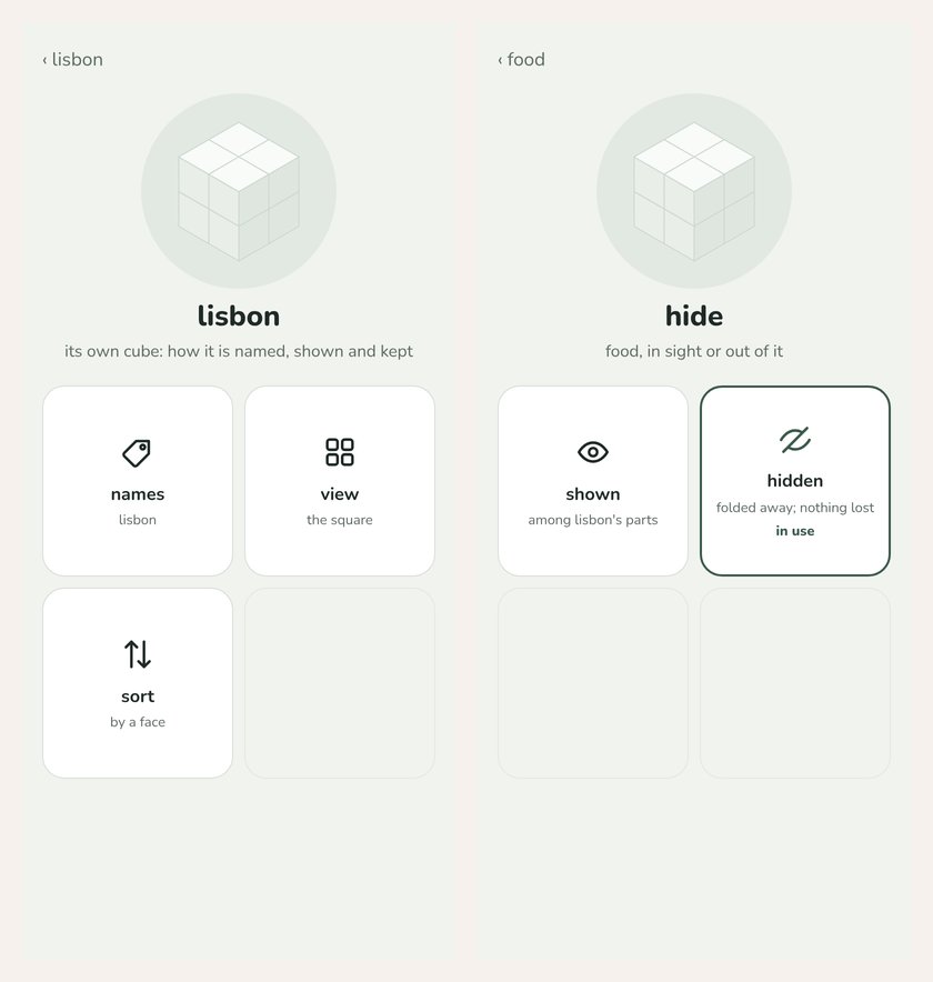
Jobs 5 and 6 added view and sort. The square was the only layout, and a cube of 100 pieces would be 10 × 10, which nobody can read. Now a cube can show one across as a list, two, three or four across, or a wider grid, and sort by when it was added, by names, or by each face, in that face’s own words. The choice is kept per cube on the phone.
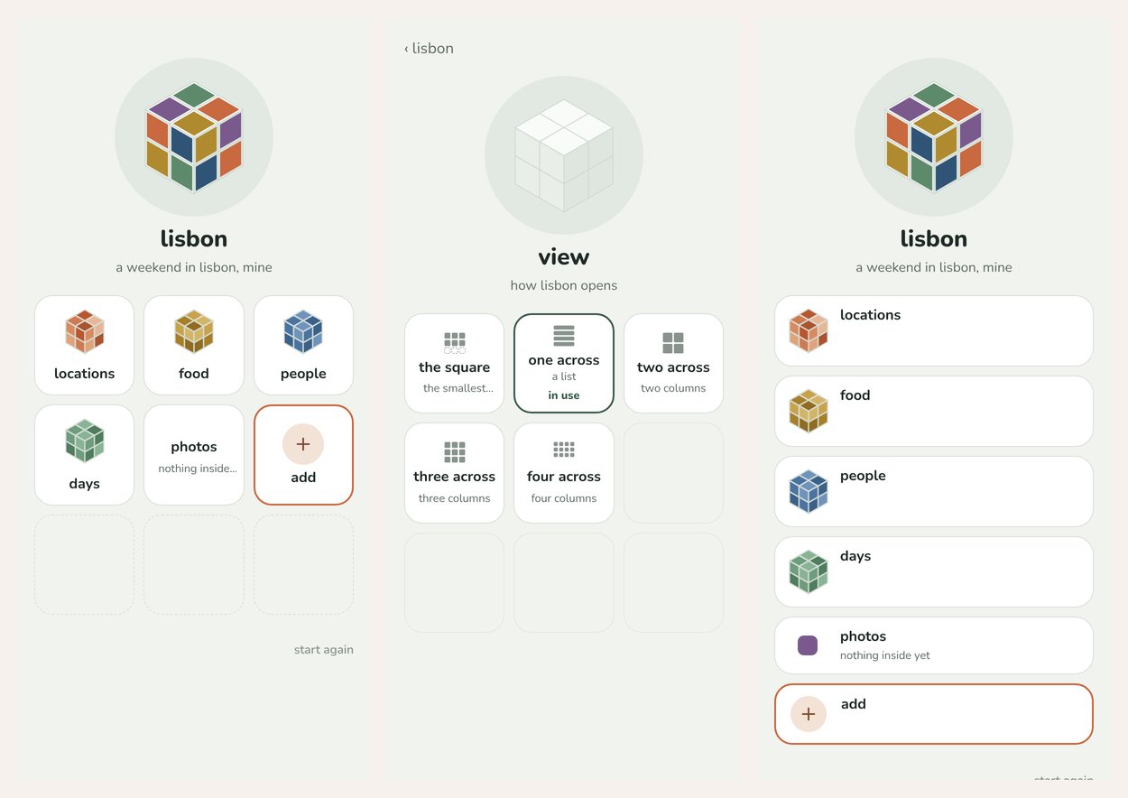
Back out of names and the part says locations. In view, one across turns the same cube into a list (prototype, mock data).
The idea underneath: the cube is the viewfinder, not the data. How a cube is shown is mine to choose, and choosing lives inside the piece’s own cube, as a cube of choices rather than a menu.
Two phrases from his doc matched nothing that was built (“the row rotation” and “n down”). They were written back as findings instead of being guessed into code. One was traced through the commits of the day before, which confirmed the reading without asking Selim to explain again.
checked on small phones
Once it was merged, a thread checked it at phone width, on four phone shapes, with touch holds, two-finger step-outs and every view and sort. Everything worked. One finding: on a very small phone, four across drops every name. And a layout chosen per cube meets whatever screen it lands on, which feeds an open question: view per cube, or per screen size?
Five findings were left open, each with a proposed answer, in a pull request for Selim to accept or not. One of them: seventeen dashed places on a cube of three pieces read as a quota, and that goes against the cube was always solved. So empty outlines only finish the last row of a view. Cube design grows from its findings, but only Selim decides.