A small ask about looks, at the end of a voice message about a scroll bug, turned into one of cube design’s oldest rules at work.
something different on top
On top of every Todarch screen sits a small cube, its stickers coloured by the open to-dos. Selim had had enough of it: “I don’t like the cube of todarch … I want to see a different visual there. It can be a Rubik’s cube with all those colours, just something different.” The coordinator split the ask from the bug and gave it a thread of its own.
The session did not guess one design. It took the same thing to show (how many to-dos, in which colours) and drew it four new ways, side by side, for one, five, fourteen and thirty to-dos: blocks stacked from the bottom, glass with each open to-do a small cube floating inside, ribbons, one band per colour as wide as its share, and dots on a dark cube. It shipped the one it would pick, glass, and left the choice to Selim. Switching is one word.
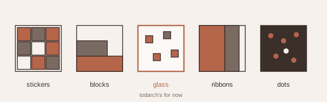
One look, five drawings: the same to-dos and colours drawn as stickers, blocks, glass, ribbons and dots.
a kind of dressing
Selim liked them, and liked more than one. “This is a kind of a dressing thing … I don’t want to lose this work … different things will work for different projects.” He kept glass for Todarch and asked for a study instead of a decision.
The study proposes what cube design has said from the start: solutions do not compete, they become options. The drawings move into the shared package, each project gets a starting drawing as one of its dials (Todarch: glass), and the person who uses the app picks their own, by holding the cube on top or in their preferences. Nothing found is thrown away; it waits to be worn.