Selim feels Todarch is chaos, not yet a tool he works in. In one evening a study found why, a prototype showed another way, and the real app followed.
my to-dos, twice
He put the feeling in his own words: “when I go in, it shows me to-dos, and then when I go in again, it shows me again my to-dos … it feels like they put another layer on top of it.” He had filed four reports minutes before, and they pointed straight at the causes.
A study read Todarch’s nine screens against cube design’s library and against the grouped home, which works the way Selim likes (stability and flexibility). The grouped home is one small model of levels and one screen that draws any level. Todarch built its tiles screen by screen and kept its own copies of logic the library has since taken over. It used the library only to lay out the square, so Mosaic ended up drawing four different tiles and two heads. The twice was real: three levels showed the same to-dos.
a prototype on the library
The new designer role made a second prototype to play with, and this time it was built on the library itself: the square, the hold, the carry, the pinch and the context cube all came from the package, and only the head and the tile were copied from the grouped home. Selim wants prototypes made this way, so they come with the library’s features built in, and a fix in the library reaches every prototype and every app. It worked on the first try.
The cube stayed on every level, on top on a phone and at the side on a desktop. “I think we are starting to keep the cube on every screen … so I want to keep that one there.” The extra layer was gone.
only the faces
Looking at the prototype, Selim decided two things. A to-do’s level should show only its data: “I want to see the data. I don’t want to see these actions here.” Cube design is about letting the person organise their own data, not about the app adding logic. So it is done became a colour on the states face, and handing over a colour on the hands face. And a cube drawn on every tile says nothing: “we need to make use of that space to give some information about whatever this tile is.” Tiles now carry the app’s signature, with its colours as bands.
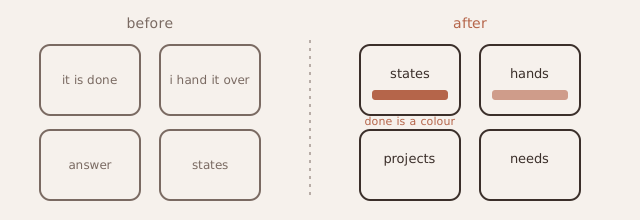
Before: a to-do’s level full of actions. After: only its faces, and done is a colour on one of them.
His decisions went into the real app the same evening. Todarch’s top is now to-dos, the faces, hidden and add. Add asks only for a name; renaming moved into the context cube. The four reports went live first.
the gap belonged to the library
On a desktop Selim saw an empty strip at the right of Todarch’s grid. The cause was not in Todarch: a square held to the window’s height stood at the start of a wider column. It was fixed once, in the library, where the square now centres itself, and every cube app got the fix. The thread that found the cause had written it down with a ready prompt; the next one picked it up and closed it the same night.